Too often it seems like things don't, won't or can't progress smoothly; then again, maybe they shouldn't. Anyway. After so many births, deaths, conventions, fairs and hiccups, here at last, another installment in my series of intermittent portfolio reveals.
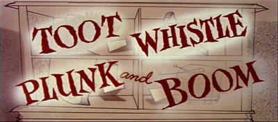
Today an acknowledgement of Ward Kimball, Charles Nichols, Dick Huemer, A. Kendall O'Connor, Victor Haboush, Eyvind Earl and Tom Oreb, who variously directed, wrote, styled and designed the classic Disney short, Toot Whistle Plunk and Boom (not to take away from every one else involved which included Marc Davis in animation).
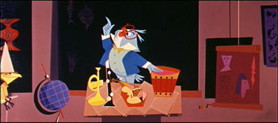
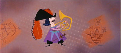
They're pretty esteemed company, and to even try to approach their level of accomplishment is foolhardy to say the least. Ward Kimball's second film (after the first Adventure in Music: Melody), Toot Whistle Plunk and Boom embraced the more stylized modern asethetic of UPA, at times combining it with full Disney animation. The result is rich and textured, clever and very very fun animation--yet even then the film relies responsibly on its writing and look, its energetic song/story played against bold, imaginative designs and bright, daring colour. It's a solid little piece.
I had seen the short a number of times off the Fantasia 2000 DVD set (which also features Meldody), and contrasted and compared it with its 50's contemporaries Gerald Mc Boing Boing, The Unicorn in the Garden and The Telltale Heart courtesy of Ron Kurer. I've also managed to watch a number of other 50's shorts from both the Disney and UPA camps, including The Saga of Windwagon Smith, Casey at the Bat, A Cowboy Needs a Horse, Rooty Toot Toot, Christopher Crumpet, Madeline and Ballet-oop, all made available from the rich film archives of Chuck Gammage. The information resource Archive.org also has a number of great films, including one entitled "Destination Earth" introduced to me by my friend James Robertson. This one was also designed by Tom Oreb and Vic Haboush, but features more limited UPA styling than the fuller cutout-y Toot stuff. After seeing its contemporaries, for the story I wanted to tell, Toot, I decided, was my model.
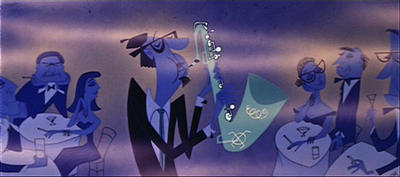
Repeated viewings offered important clues to its specific mechanics of writing and structure. It's organized into segments that contain their own rules of staging, colour, styling and storytelling--it's a little idiosyncratic, which is kind of nice. It was pretty paramount to try to understand some of the logic of these choices to create something even vaguely in the same spirit, but comparing and contrasting it with its predecessor Melody helped immeasurably in understanding how the style and structure had matured into what it was. It is, in the end, a fun, attractive, informative and completely unique film. It's very much of its time, but strikingly fresh--even today! I don't tend to draw in the retro-graphic style that everyone seems to these days, so it was actually a bit of a push to get me into the arena of flat shape. And tone. And colour. And composition. And... well, it was all a challenge we'll say; but I guess more of that later.
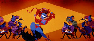
Anyway. Thank you to the creators of this terrific short. A big thanks to Ward Jenkins for offering such a terrific resource, and from whom these images are lifted; Amid Amidi's Cartoon Modern Blog for sharing information on animation's interesting history; and to Disney for their forthcoming DVD release Disney Rarities: Celebrated Shorts, featuring many hard to find stand alone shorts.
I promise there'll be more artwork later.
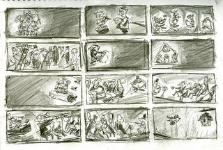
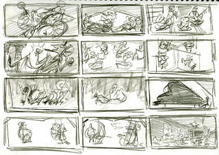
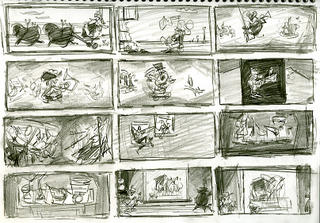

So you're working on a short, huh? Cool! I have seen that short with the blue owl...I got a childhood flachback when I saw it on the Fantasia 2000 DVD. Very unique style; I like the way it looks.
ReplyDeleteYour compositions were for your short film too?
a
Yup, I'm working on a film! Finishing up actually--just the preproduction stuff. These compositions are studies from Toot Whistle Plunk & Boom. Hopefully I'll put up more substantial stuff soon.
ReplyDeleteExcellent appraisal & study of ' TOOT . . . '. Cool blog too - lots of interesting stuff on here & your life sketches are superb.
ReplyDeleteNice write up, Mr. Sung. Toot has got to be one of my favorite pieces of animation.
ReplyDeleteGood luck with the film......I'd love to hear more about it.....
Really cool studies Nick...
ReplyDeleteVery creative stuff you have here! I'll defenetly keep an eye on your blog!
ReplyDeleteGreat work and a great blog Nick!
ReplyDeleteI see you're a Sheridan Grad as well. Did you grad 2000-2001?
Hey nick,
ReplyDeleteLove yr sketches, it's so good to get a peek of what yr up to lately. Hope things are well!
I'm very happy to see that others are using the images I grabbed for purposes like this! Great job in analyzing TOOT and I do wish you the best in your side project! Keep it up.
ReplyDelete(And I posted a comment on Amid's Cartoon Modern post, by the way. Thanks again for the mention.)
BEAUTIFUL!!! ;)
ReplyDeleteOne of my favorite films too. Sweet stills.
ReplyDelete