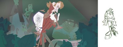
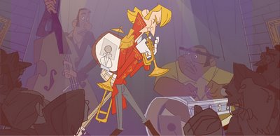
 Sorry for the monday absence--there were blogger issues. Now, another deconstruction post, before we move into the storyboards. Today, the jazz scene:
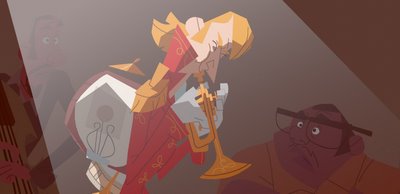
The idea here is that as an adult, Mike is having a tough time holding down a job--he doesn't play the same kind of music that the other cats are playing. There's a rock band version of this, and a classical concert hall take, but for my splash page, I thought a jazz scene would be fun.
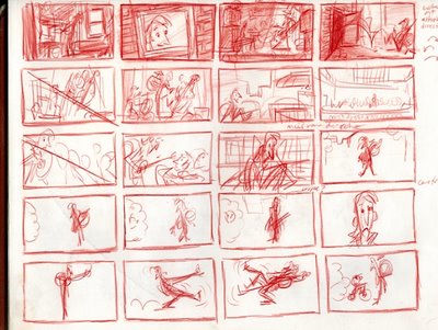
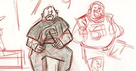
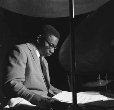
I referenced photographs, obviously, but also got out and listened to some big band at one of toronto's many jazz festivals.
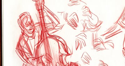
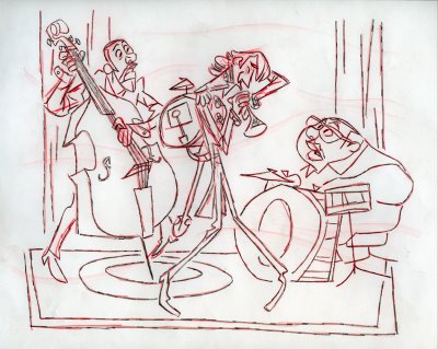
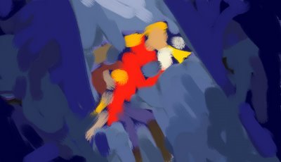
The basic setup of the scene was always the same, although it did take a while to translate my meaningless scribbles to something more specific.
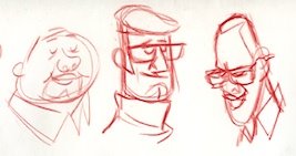
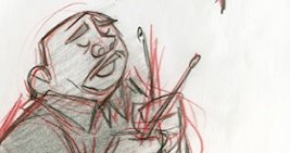
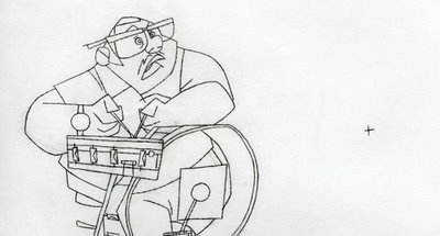
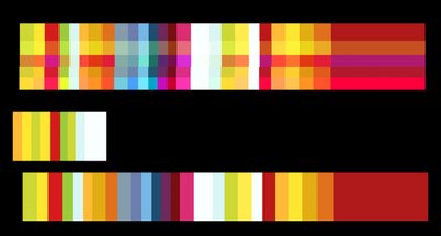
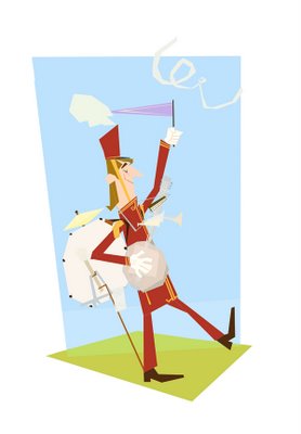
At the same time that I was designing the characters, I was also trying to invent a colour scheme, again struggling to avoid the literal and cliche insofar as I could--Toot Whistle gets pretty wild with its colours sometimes, and I thought that this was a great place to heighten things similarly--perhaps push lighting or atmosphere, in a film that's otherwise meant to be pretty flat.
In my work I try to construct rythyms and patterns, scripts and arcs for stuff like the use of space, colour, shapes, framing (etc, etc. etc.)--it's all very Bruce Block, and very much tied in to the concerns I have at work these days. It took a lot of reminding from my friend Dani to really listen to what the scene was about--how it's supposed to feel--and to use that as a starting point; thanks to her, I think it turned out alright in the end.
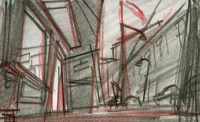
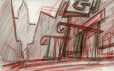
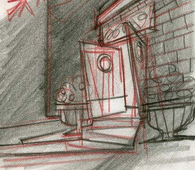
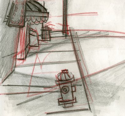
As something of an aside, there was a bit where I was really trying to figure out what the hall itself should look like, and eventually my approach turned to designing the outside of the place to give me ideas for the inside (?). In the end I just dropped it--kept it pretty vague, because it wasn't so important anyway, but it was fun to go down this road nonetheless, and it helped me think about the wider world he was in and its bounding visual rules:


Excellent stuff!
ReplyDeleteWow, what a great blog! It looks awesome, really dig the style a lot. Would love to see it as a full length feature.
ReplyDeleteHans
This one of the most inspiring post that I've evercome across while blogging your a treasure to the art community Nick VERY DOPE WORK BRO hope your kool like the breeze take care!!!
ReplyDeleteI'm enjoying the ride you're taking us on, Nick! You've shown how developing a show with characters, setups and story is both a process of expansion of the ideas and a contraction; simplifying down to the eventual result. A vibrant presentation. I also like how you've credited Daniela for her imput. Kudos!
ReplyDeleteLove those smokey atmospheric jazz club setups.~ Arna
Very, very interesting post. I love this design. The colors are gorgeous!
ReplyDeleteYour taste is excellent!
I love it!!
ReplyDeletea
Wow!
ReplyDeleteHUGE compliments from everyone--
thank you all very much--I often feel on the fence about much of this stuff, so your compliments are very gratifying.
cheers!
nick
Well. Yeah.
ReplyDeleteYou are truly talented. Thank you so much for sharing all these with us. Im really happy you posted this page, was my favourite. Great composition and shapes.
ReplyDeleteimpressive