May 05, 2006

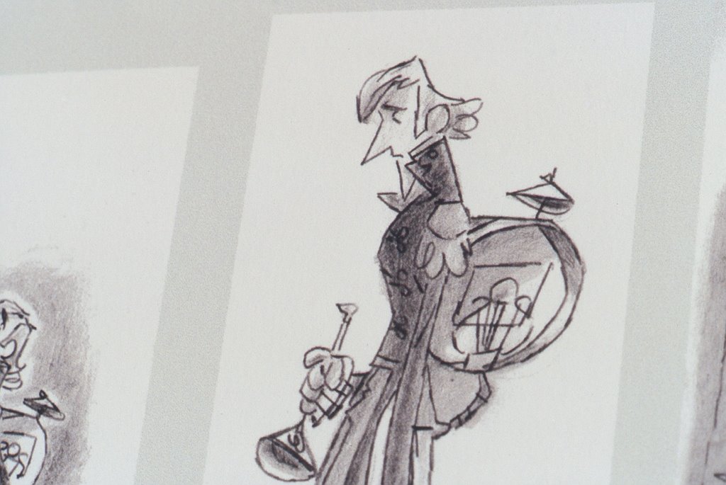
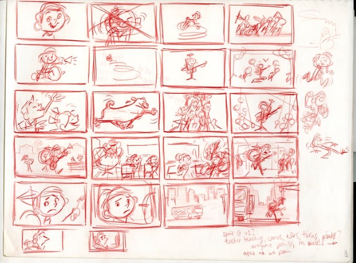
STORY SKETCHES 1

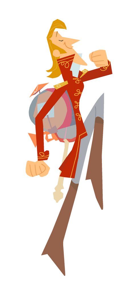
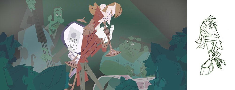
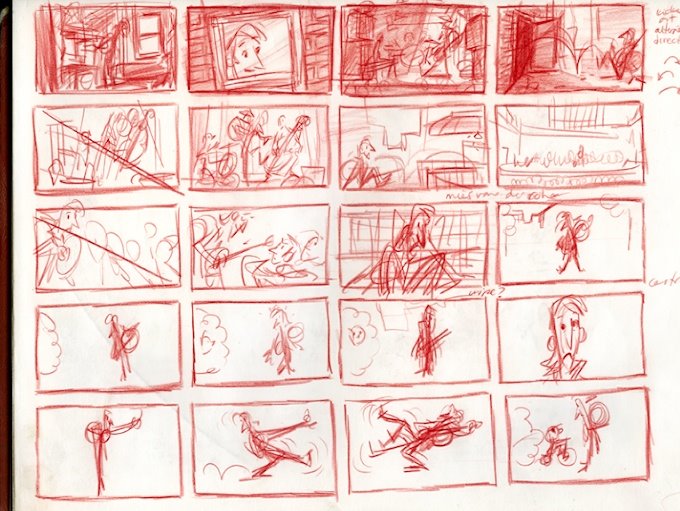
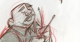
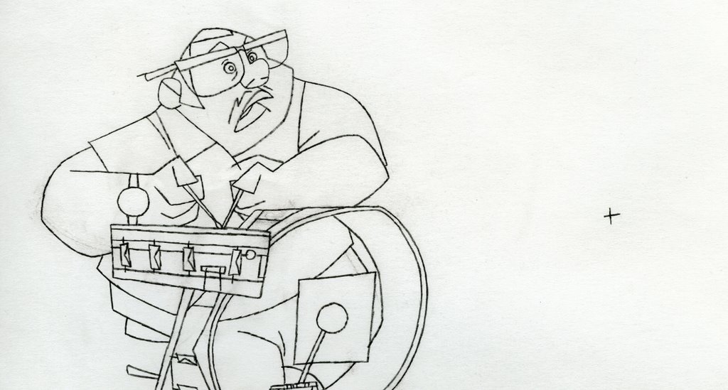
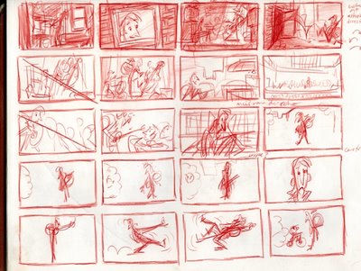
My story sketches mark the film in broad strokes, describing emotional, plot and visual points that suggest the film's terrain; some snapshots.


more to come...

May 02, 2006

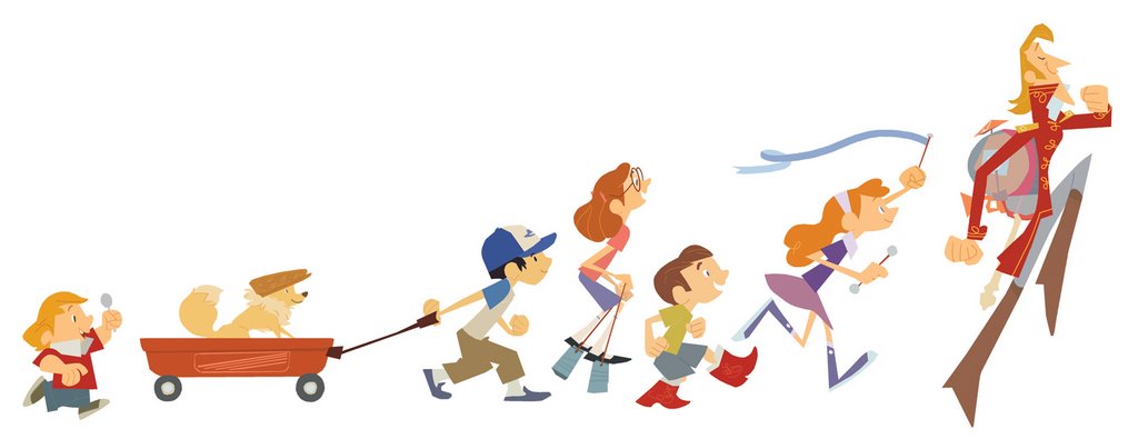
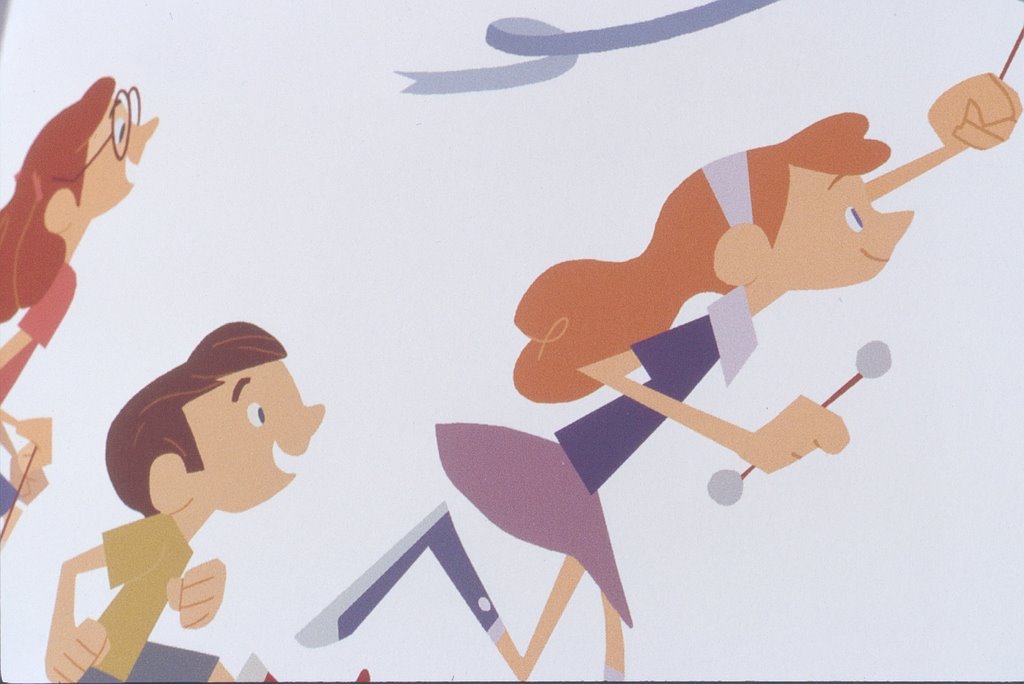
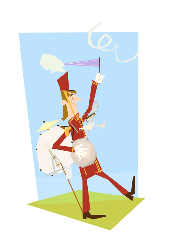
PARADE!

AH! before boards I forgot about one more splash page--it acts as a bit of a transition between the front and back halves of my book.

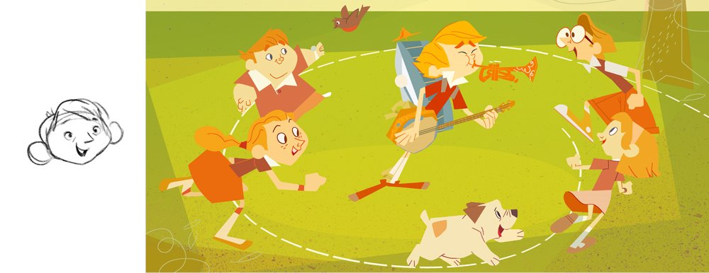
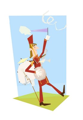
That's me in the hat there, with my little dog in the wagon. This was a real fun one to put together, and I sadly had lots of ideas that I had to cut for the sake of a reasonably sized image (big wheelers, cans filled with beans, hula hoops, someone blowing bubbles out of a pipe, pogo sticks, paper hats, pinwheels... every imaginable wholesome thing. At least I got a dog with a hat in.)


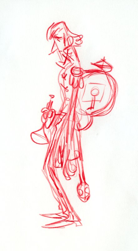
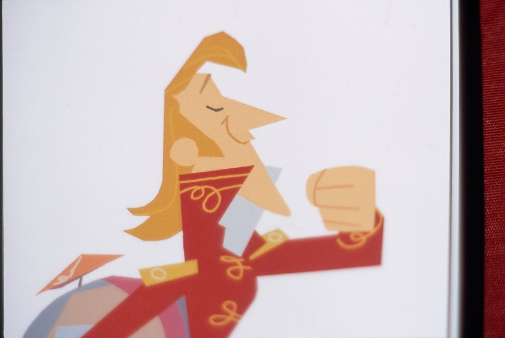
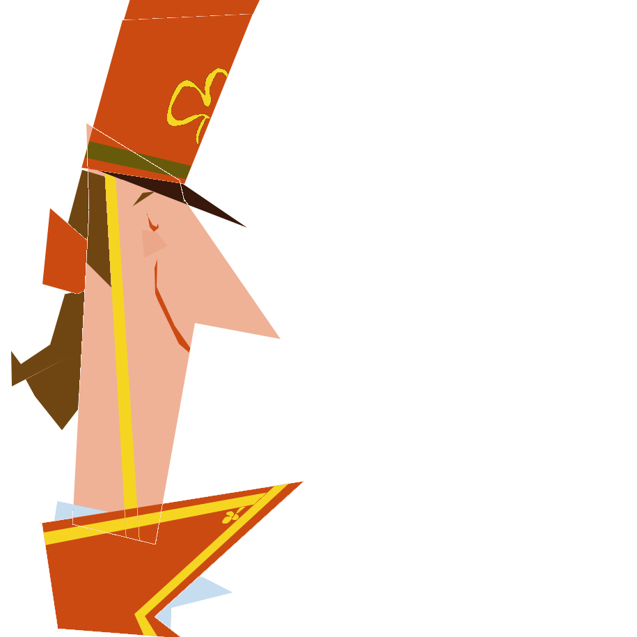
The design on this was pretty straightforward--nothing too groundbreaking--just going for 'classic' Disney energy and appeal. I looked at a bunch of the Milt Kahl stuff for the Brave Engineer and Johnny Appleseed. PHEW! Good stuff.


When I have a choice, I try surround myself with things that have a quality American designers Ray and Charles Eames called 'way-it-should-be-ness'; a kind of perfection of appropriateness. Establishing the integrity of my own projects is one of my supreme joys, and originates, quite obviously, from the particular story I'm trying to tell. Every aesthetic decision starts with the story, and that approach allows me (or at least allows me to try) to tackle different projects with confidence; an editorial outlook becomes the key to assmbling the pieces of any aesthetic puzzle.


A general feeling of pleasantry or 'happiness' seems like no great starting point, but in this case, it was as simple as that. I can't deny the great pleasure I derive from the visuals of Toot Whistle Plunk & Boom, my Little Golden Books, and my other design touchstones. Appeal is a mysterious and powerful thing that, I think, can be worked towards in all areas: story, design, animation, music... and it makes everything right and likeable; compulsively watchable, as some would say.


Anyway, here I was trying to communicate something fun and honest and I hope I did that. I tried to create a range of heights and shapes and colours, tried to make associations and add fun little details. Look for 'em! Listen to the Firehouse 5 + 2, imagine kids marching, and you'll see too--the image draws itself.


Until next time...


April 30, 2006

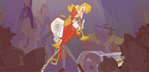
JAZZ

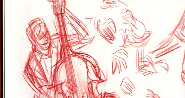
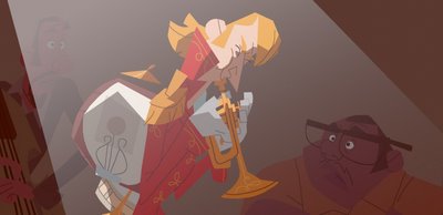
Sorry for the monday absence--there were blogger issues. Now, another deconstruction post, before we move into the storyboards. Today, the jazz scene:

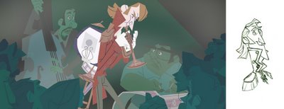
The idea here is that as an adult, Mike is having a tough time holding down a job--he doesn't play the same kind of music that the other cats are playing. There's a rock band version of this, and a classical concert hall take, but for my splash page, I thought a jazz scene would be fun.
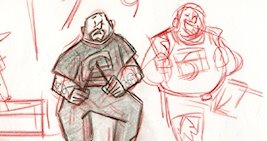

I referenced photographs, obviously, but also got out and listened to some big band at one of toronto's many jazz festivals.
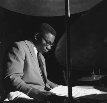
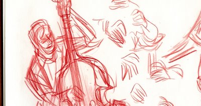

The basic setup of the scene was always the same, although it did take a while to translate my meaningless scribbles to something more specific.
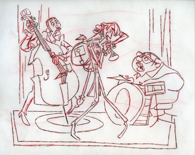
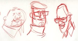
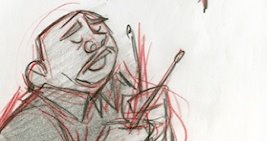
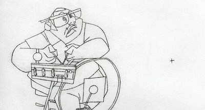

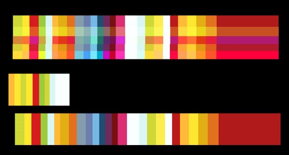
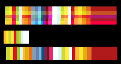
At the same time that I was designing the characters, I was also trying to invent a colour scheme, again struggling to avoid the literal and cliche insofar as I could--Toot Whistle gets pretty wild with its colours sometimes, and I thought that this was a great place to heighten things similarly--perhaps push lighting or atmosphere, in a film that's otherwise meant to be pretty flat.

In my work I try to construct rythyms and patterns, scripts and arcs for stuff like the use of space, colour, shapes, framing (etc, etc. etc.)--it's all very Bruce Block, and very much tied in to the concerns I have at work these days. It took a lot of reminding from my friend Dani to really listen to what the scene was about--how it's supposed to feel--and to use that as a starting point; thanks to her, I think it turned out alright in the end.
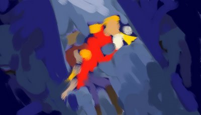
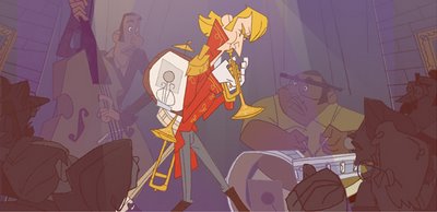

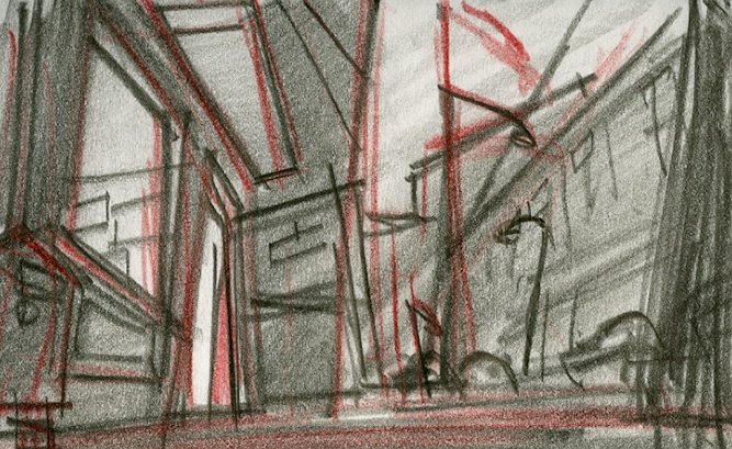
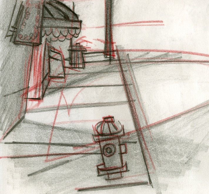
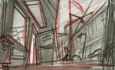
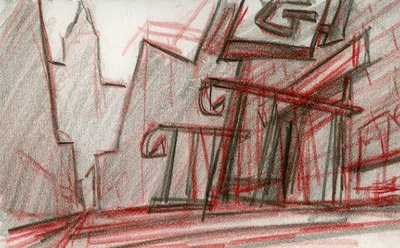
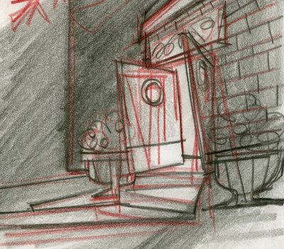
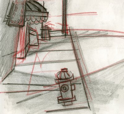
As something of an aside, there was a bit where I was really trying to figure out what the hall itself should look like, and eventually my approach turned to designing the outside of the place to give me ideas for the inside (?). In the end I just dropped it--kept it pretty vague, because it wasn't so important anyway, but it was fun to go down this road nonetheless, and it helped me think about the wider world he was in and its bounding visual rules:


Tomorrow: on with the show!
April 28, 2006

...


No time to post today--I'll be back monday.
Have a good weekend folks, and thanks for dropping by!

April 26, 2006

KIDS


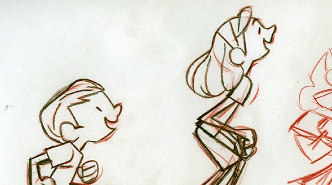
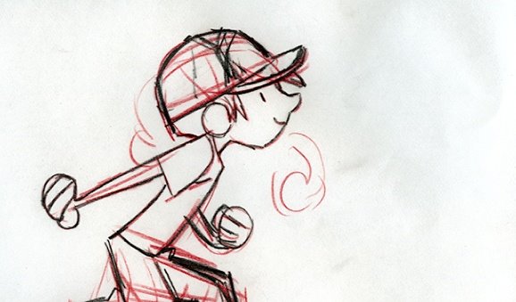
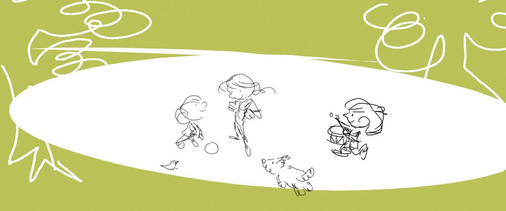
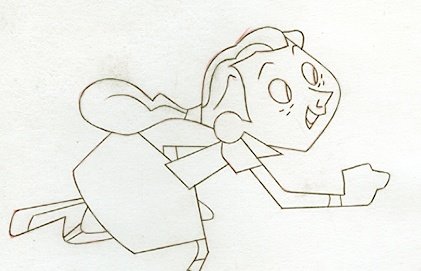
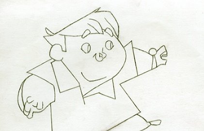
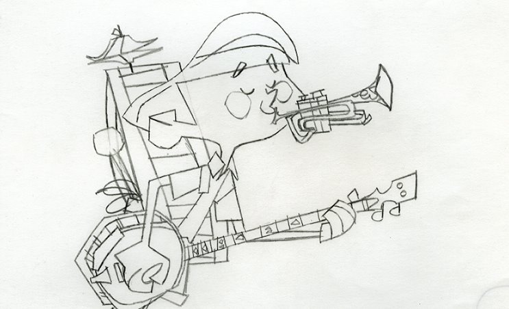
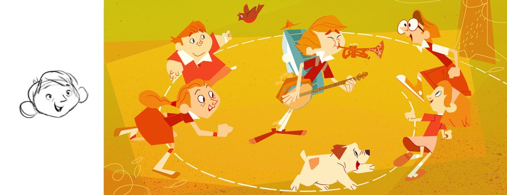
I promised someone I'd get more into this, so I thought I'd show some of the development art that went into these images. I do a lot of redrawing, trying to think through every concievable possibility, and trying, trying anyway, to improve my drawings.


I was really searching for appeal here, trying to ape the greats like Alice and Martin Provensen, Tom Oreb, Milt Kahl, Sunny B Cook, Marc Simont and JP Miller, and new guys like Joe Moshier who spin out these very sophisticated graphic drawings--designs that suggest three dimensionality while at the same time being pretty clever with the graphic space. For a while I got caught up in UPA stuff however, and it sort of got me off track--"Oh yeah!," I remembered, "TOOT WHISTLE PLUNK & BOOM!"


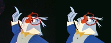
Toot Whistle Plunk & Boom by itself was a big resource, although the characters come in many different shapes, sizes and styles. The solutions Toot Whistle suggested over similar films like its sister Melody, and UPA's masterpiece Gerald McBoingBoing, were more appropriate to the type of storytelling I anticipated in my 'film', so I went after that Professor Owl character of theirs; that was the level of complexity I felt my characters needed to get across the emotions they were to have... if my writing and boarding stood up.


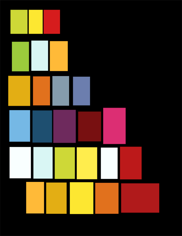
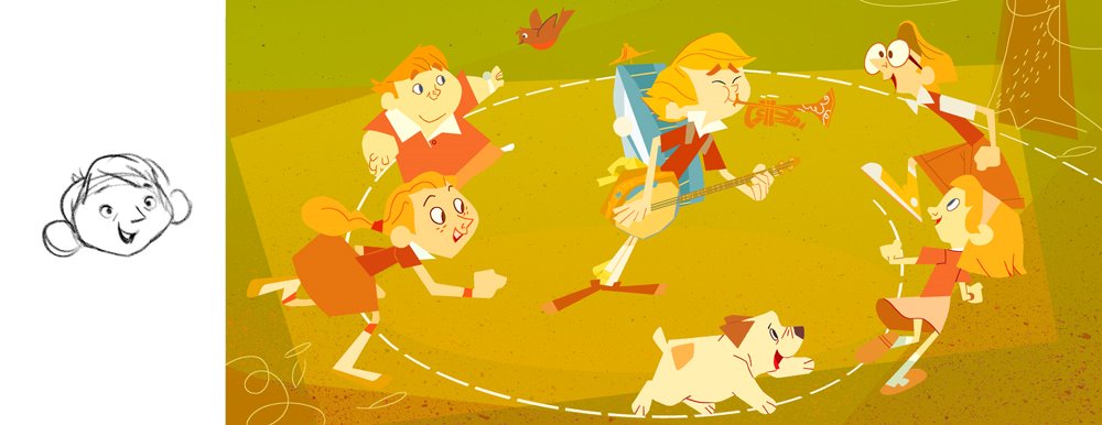
I should also mention that colour was a big thing for me, as I'm not usually accustomed to making coloured, or even toned artwork--I'm a lot better at it now as a result. I was really trying to push myself in new directions with this thing--trying to think more graphically (also not the way I typically draw), and as a result, it took me a while to get off preconcieved notions about how colour 'should' work. I spent a lot of time trying to make grass green believe it or not, but after some convincing from my friends Dani Strijleva and Mary Blair (mostly, although I also referenced Aurelius Battaglia, Eyvind Earle and Joseph Albers), I eventually learned to think outside the box and defy my own expectations.

At first I wasn't sure if I was going to try to gouache it or photoshop it--photoshop won, but I did try to do some gouache layers for texture. Below, photoshop viability test, then, some alternate versions...