
 AH! before boards I forgot about one more splash page--it acts as a bit of a transition between the front and back halves of my book.
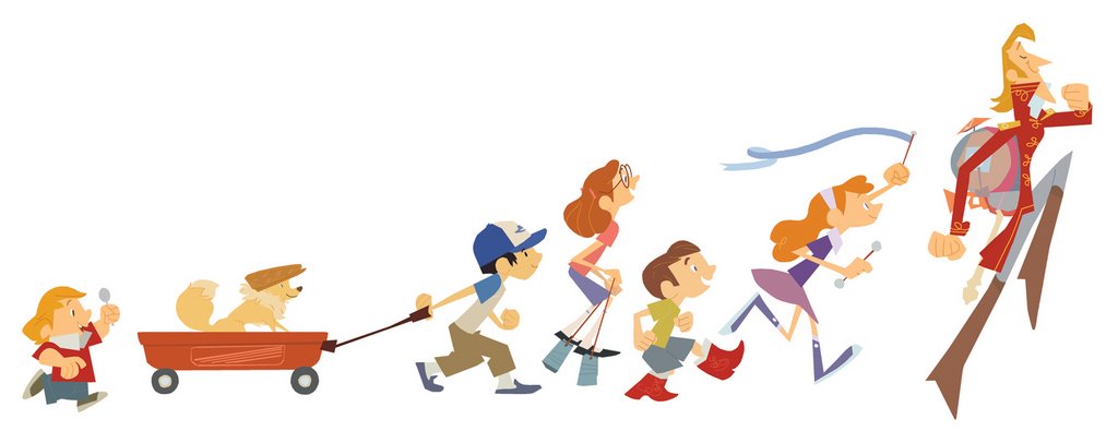
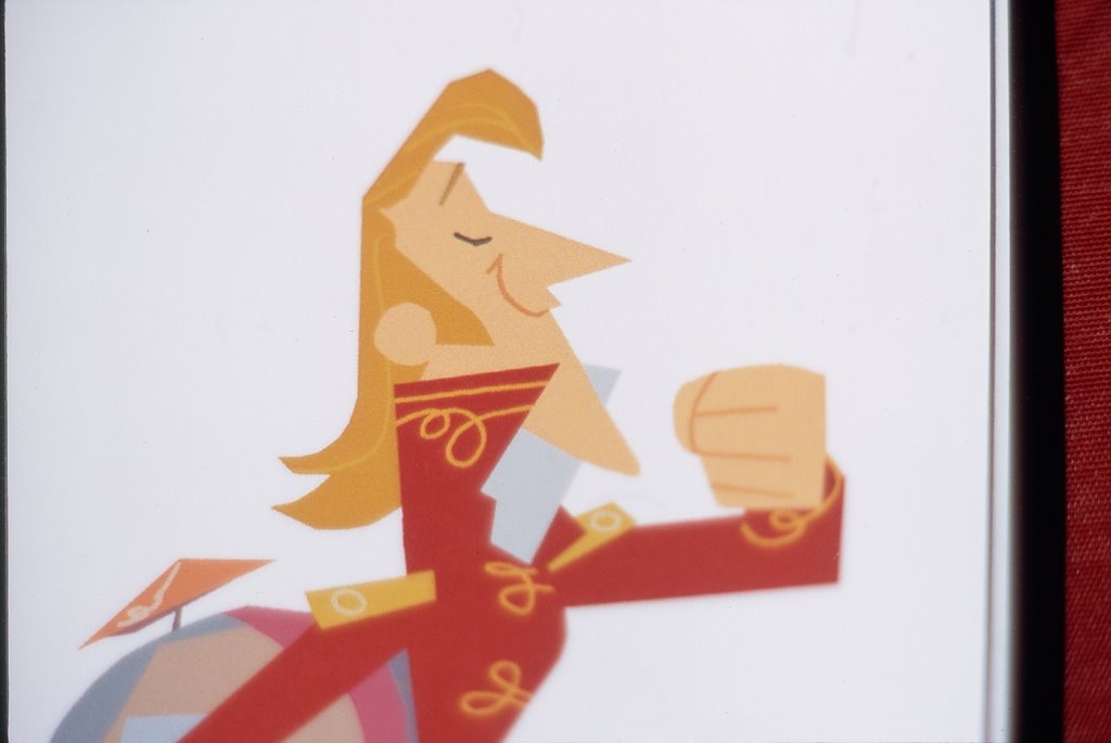
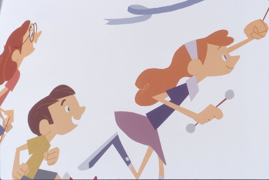
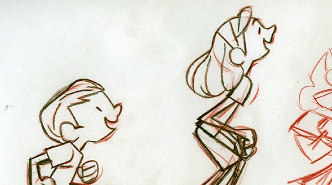
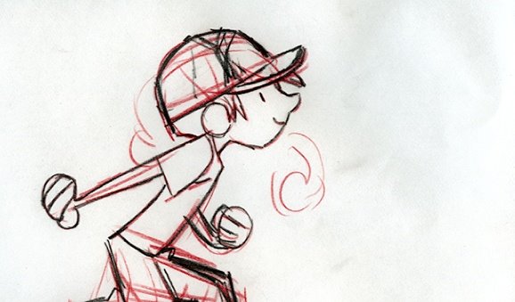
 That's me in the hat there, with my little dog in the wagon. This was a real fun one to put together, and I sadly had lots of ideas that I had to cut for the sake of a reasonably sized image (big wheelers, cans filled with beans, hula hoops, someone blowing bubbles out of a pipe, pogo sticks, paper hats, pinwheels... every imaginable wholesome thing. At least I got a dog with a hat in.)

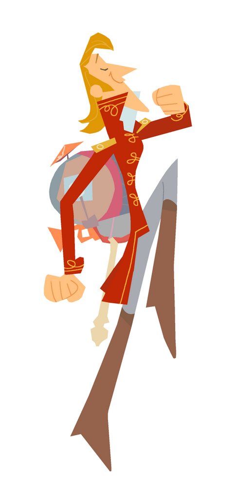
The design on this was pretty straightforward--nothing too groundbreaking--just going for 'classic' Disney energy and appeal. I looked at a bunch of the Milt Kahl stuff for the Brave Engineer and Johnny Appleseed. PHEW! Good stuff.
When I have a choice, I try surround myself with things that have a quality American designers Ray and Charles Eames called 'way-it-should-be-ness'; a kind of perfection of appropriateness. Establishing the integrity of my own projects is one of my supreme joys, and originates, quite obviously, from the particular story I'm trying to tell. Every aesthetic decision starts with the story, and that approach allows me (or at least allows me to try) to tackle different projects with confidence; an editorial outlook becomes the key to assmbling the pieces of any aesthetic puzzle.
A general feeling of pleasantry or 'happiness' seems like no great starting point, but in this case, it was as simple as that. I can't deny the great pleasure I derive from the visuals of Toot Whistle Plunk & Boom, my Little Golden Books, and my other design touchstones. Appeal is a mysterious and powerful thing that, I think, can be worked towards in all areas: story, design, animation, music... and it makes everything right and likeable; compulsively watchable, as some would say.
Anyway, here I was trying to communicate something fun and honest and I hope I did that. I tried to create a range of heights and shapes and colours, tried to make associations and add fun little details. Look for 'em! Listen to the Firehouse 5 + 2, imagine kids marching, and you'll see too--the image draws itself.


Inspiring post Nick.
ReplyDeletethanks for sharing!! really inspiring to say the least!!
ReplyDeleteMaybe I already said this but--I really REALLY like this idea and these characters!!
ReplyDeletea
Yeah, Nick's the master of appeal.
ReplyDeleteJames; smug.
ReplyDeletejust kidding. thanks!
also to patrick and robin and amelia--
thanks for sticking with me!
"Wonderfulperfect" is what I'm feeling too. Very awesome work Nick! i enjoy seeing your work and equally enjoy reading your words.
ReplyDeleteWell cause i agree but i think there is a bit missing, im going to go for.
ReplyDelete"wonderperfectfulmarrymeandbaremyartchildrenawesomeness"
I think thats a new word, it should be in the dictionary under double double.
Great stuff nick oh mighty master of colour. bestow upon me thy knowledge!
Excellent splash page!
ReplyDeleteYou mentioned Milt Khal's design but I see also some Tom Oreb influences as well.
Looking forward to the next post.
Yeah,I'm not being smug. Good outs.
ReplyDeleteCan't have enought of these great works!! WOW!!
ReplyDelete