

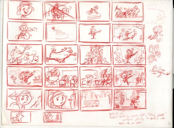
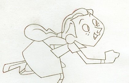
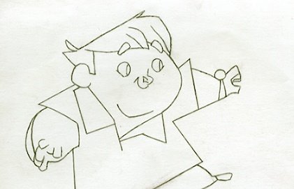
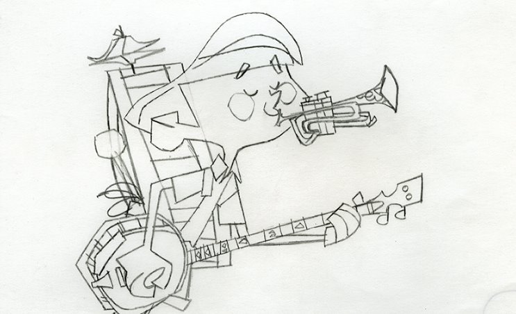
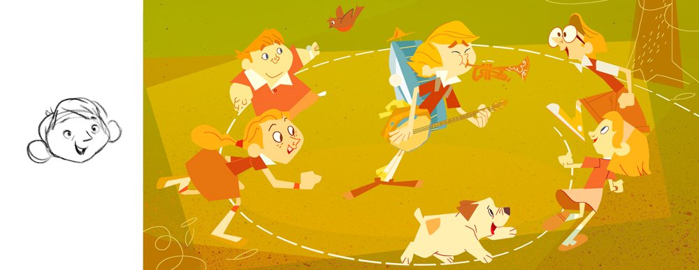
I promised someone I'd get more into this, so I thought I'd show some of the development art that went into these images. I do a lot of redrawing, trying to think through every concievable possibility, and trying, trying anyway, to improve my drawings.
I was really searching for appeal here, trying to ape the greats like Alice and Martin Provensen, Tom Oreb, Milt Kahl, Sunny B Cook, Marc Simont and JP Miller, and new guys like Joe Moshier who spin out these very sophisticated graphic drawings--designs that suggest three dimensionality while at the same time being pretty clever with the graphic space. For a while I got caught up in UPA stuff however, and it sort of got me off track--"Oh yeah!," I remembered, "TOOT WHISTLE PLUNK & BOOM!"

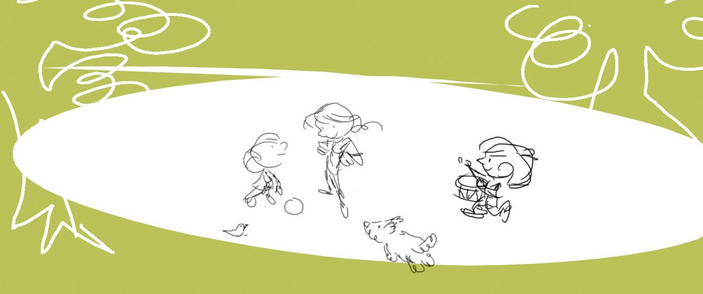

Toot Whistle Plunk & Boom by itself was a big resource, although the characters come in many different shapes, sizes and styles. The solutions Toot Whistle suggested over similar films like its sister Melody, and UPA's masterpiece Gerald McBoingBoing, were more appropriate to the type of storytelling I anticipated in my 'film', so I went after that Professor Owl character of theirs; that was the level of complexity I felt my characters needed to get across the emotions they were to have... if my writing and boarding stood up.

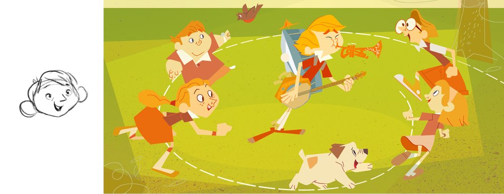
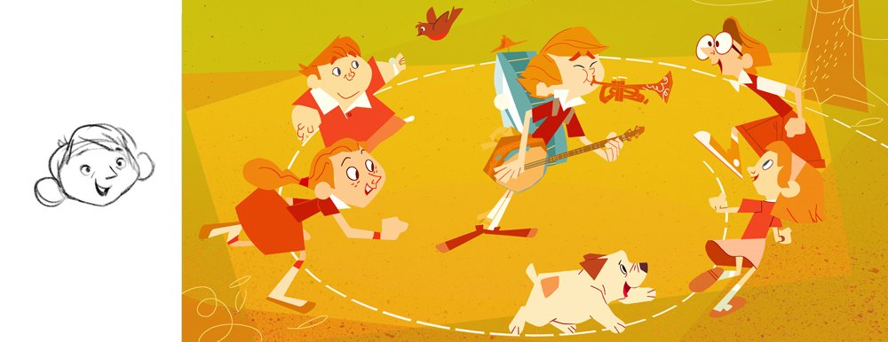
I should also mention that colour was a big thing for me, as I'm not usually accustomed to making coloured, or even toned artwork--I'm a lot better at it now as a result. I was really trying to push myself in new directions with this thing--trying to think more graphically (also not the way I typically draw), and as a result, it took me a while to get off preconcieved notions about how colour 'should' work. I spent a lot of time trying to make grass green believe it or not, but after some convincing from my friends Dani Strijleva and Mary Blair (mostly, although I also referenced Aurelius Battaglia, Eyvind Earle and Joseph Albers), I eventually learned to think outside the box and defy my own expectations.
At first I wasn't sure if I was going to try to gouache it or photoshop it--photoshop won, but I did try to do some gouache layers for texture. Below, photoshop viability test, then, some alternate versions...
man, you are on FIRE! keep it coming. This is the some of the most inspiring stuff Ive seen in a long time
ReplyDeleteAbsolutely BRILLIANT WORK NICK!!!
ReplyDeleteDelicious! There's so much here to study, admire, read, enjoy... exciting, exciting stuff, Nick. Thanks so much for sharing the process with us. We'll visit again and soak up in more detail.
ReplyDeleteThanks also, for the excellent bookbinder link.
Thanks fellas--
ReplyDeleteI'm glad you think this stuff's alright.
I hope you all stick around until the end!
Great great stuff Nick!
ReplyDeletewow, very cool stuff!!
ReplyDelete